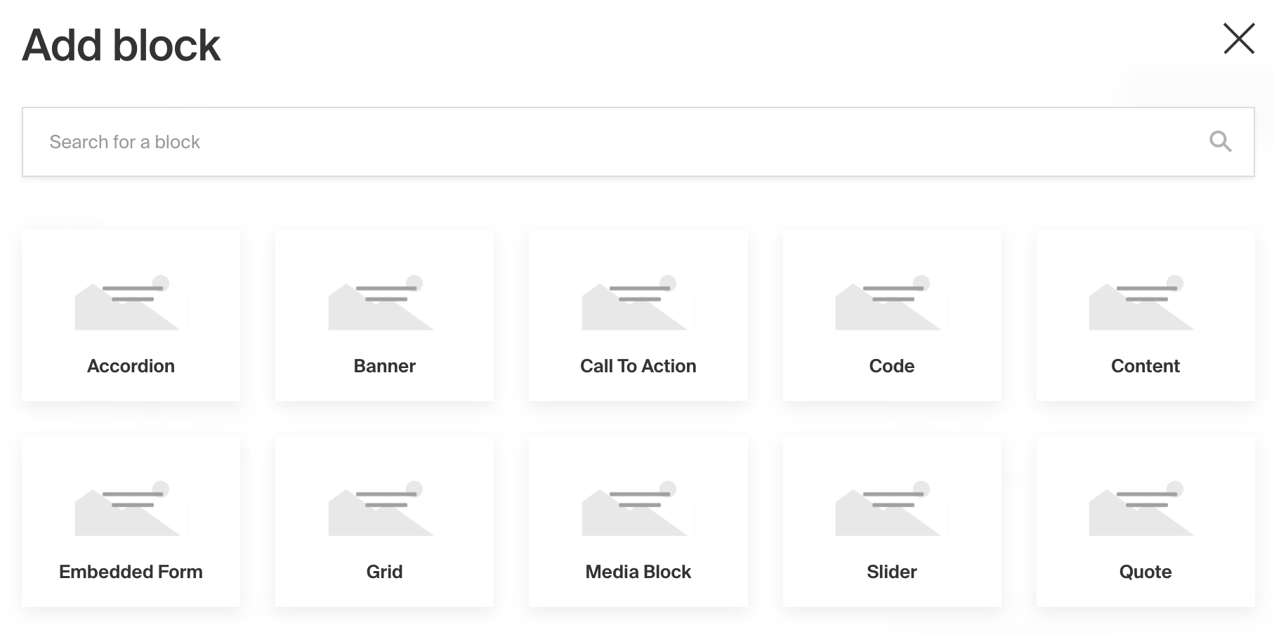
Blocks Field

Example uses:
- A layout builder tool that grants editors to design highly customizable page or post layouts. Blocks could include
configs such as
Quote,CallToAction,Slider,Content,Gallery, or others. - A form builder tool where available block configs might be
Text,Select, orCheckbox. - Virtual event agenda "timeslots" where a timeslot could either be a
Break, aPresentation, or aBreakoutSession.
Field config
| Option | Description |
|---|---|
name * | To be used as the property name when stored and retrieved from the database. More |
label | Text used as the heading in the Admin panel or an object with keys for each language. Auto-generated from name if not defined. |
blocks * | Array of block configs to be made available to this field. |
validate | Provide a custom validation function that will be executed on both the Admin panel and the backend. More |
minRows | A number for the fewest allowed items during validation when a value is present. |
maxRows | A number for the most allowed items during validation when a value is present. |
saveToJWT | If this field is top-level and nested in a config supporting Authentication, include its data in the user JWT. |
hooks | Provide field-level hooks to control logic for this field. More |
access | Provide field-level access control to denote what users can see and do with this field's data. More |
hidden | Restrict this field's visibility from all APIs entirely. Will still be saved to the database, but will not appear in any API response or the Admin panel. |
defaultValue | Provide an array of block data to be used for this field's default value. More |
localized | Enable localization for this field. Requires localization to be enabled in the Base config. If enabled, a separate, localized set of all data within this field will be kept, so there is no need to specify each nested field as localized. |
unique | Enforce that each entry in the Collection has a unique value for this field. |
labels | Customize the block row labels appearing in the Admin dashboard. |
admin | Admin-specific configuration. See below for more detail. |
custom | Extension point for adding custom data (e.g. for plugins) |
* An asterisk denotes that a property is required.
Admin Config
In addition to the default field admin config, you can adjust the following properties:
| Option | Description |
|---|---|
initCollapsed | Set the initial collapsed state |
isSortable | Disable block order sorting by setting this value to false |
Block configs
Blocks are defined as separate configs of their own.
| Option | Description |
|---|---|
slug * | Identifier for this block type. Will be saved on each block as the blockType property. |
fields * | Array of fields to be stored in this block. |
labels | Customize the block labels that appear in the Admin dashboard. Auto-generated from slug if not defined. |
imageURL | Provide a custom image thumbnail to help editors identify this block in the Admin UI. |
imageAltText | Customize this block's image thumbnail alt text. |
interfaceName | Create a top level, reusable Typescript interface & GraphQL type. |
graphQL.singularName | Text to use for the GraphQL schema name. Auto-generated from slug if not defined. NOTE: this is set for deprecation, prefer interfaceName. |
dbName | Custom table name for this block type when using SQL database adapter (Postgres). Auto-generated from slug if not defined. |
custom | Extension point for adding custom data (e.g. for plugins) |
Auto-generated data per block
In addition to the field data that you define on each block, Payload will store two additional properties on each block:
blockType
The blockType is saved as the slug of the block that has been selected.
blockName
The Admin panel provides each block with a blockName field which optionally allows editors to label their blocks for
better editability and readability.
Example
collections/ExampleCollection.js
TypeScript
As you build your own Block configs, you might want to store them in separate files but retain typing accordingly. To do
so, you can import and use Payload's Block type: