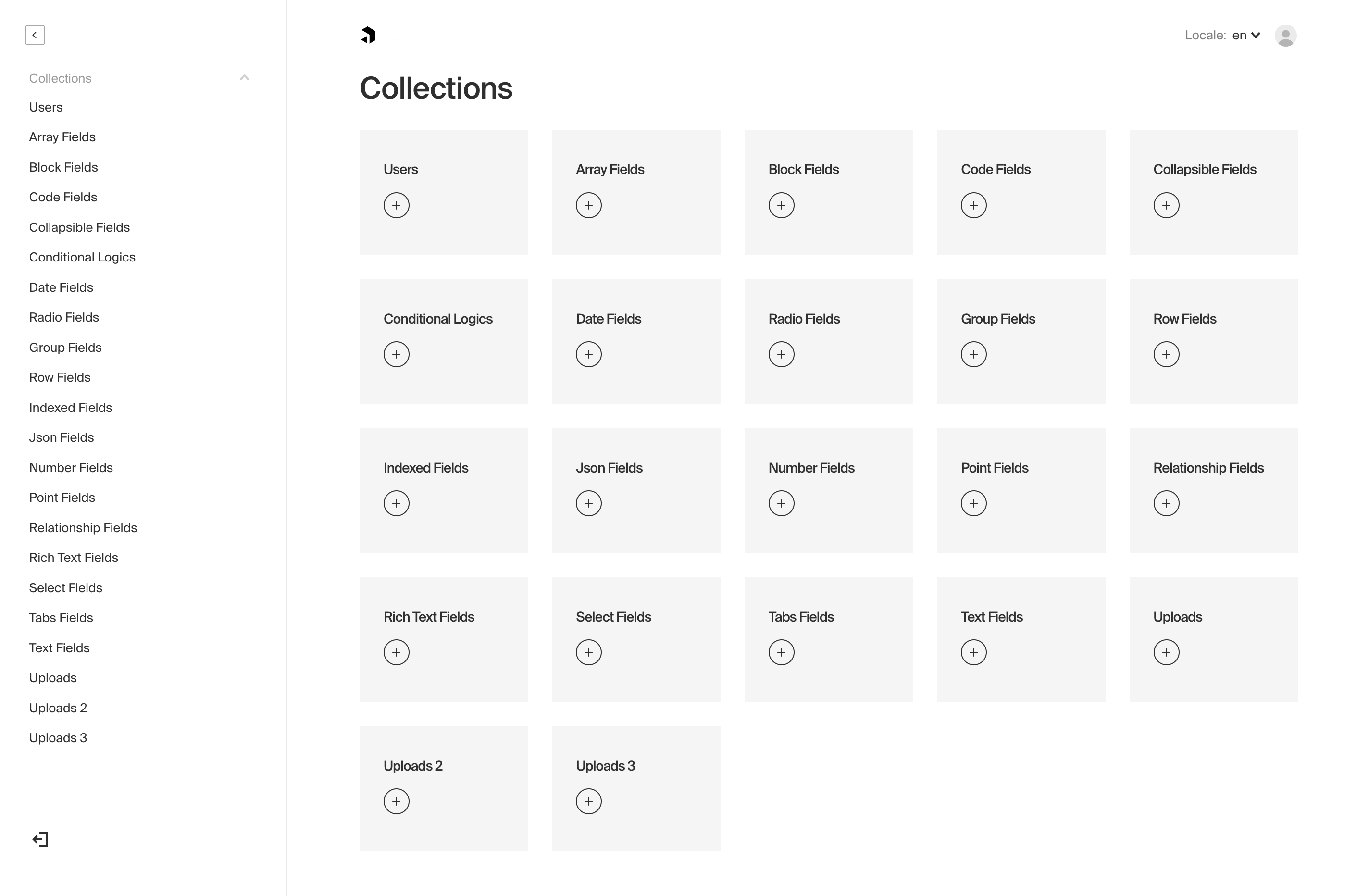
The Admin Panel
Payload dynamically generates a beautiful, fully functional React admin panel to manage your data. It's extremely powerful and can be customized / extended upon easily by swapping in your own React components. You can add additional views, modify how built-in views look / work, swap out Payload branding for your client's, build your own field types and much more.
The Payload Admin panel can be bundled with our officially supported Vite and webpack bundlers or you can integrate another bundler following our adapter pattern approach. When bundled, it is code-split, highly performant (even with 100+ fields), and written fully in TypeScript.

Admin Options
All options for the Admin panel are defined in your base Payload config file.
| Option | Description |
|---|---|
bundler | The bundler that you would like to use to bundle the admin panel. Officially supported bundlers: Webpack and Vite. |
user | The slug of a Collection that you want be used to log in to the Admin dashboard. More |
buildPath | Specify an absolute path for where to store the built Admin panel bundle used in production. Defaults to path.resolve(process.cwd(), 'build'). |
meta | Base meta data to use for the Admin panel. Included properties are titleSuffix, ogImage, and favicon. |
disable | If set to true, the entire Admin panel will be disabled. |
indexHTML | Optionally replace the entirety of the index.html file used by the Admin panel. Reference the base index.html file to ensure your replacement has the appropriate HTML elements. |
css | Absolute path to a stylesheet that you can use to override / customize the Admin panel styling. More. |
scss | Absolute path to a Sass variables / mixins stylesheet meant to override Payload styles to make for an easy re-skinning of the Admin panel. More. |
dateFormat | Global date format that will be used for all dates in the Admin panel. Any valid date-fns format pattern can be used. |
avatar | Set account profile picture. Options: gravatar, default or a custom React component. |
autoLogin | Used to automate admin log-in for dev and demonstration convenience. More. |
livePreview | Enable real-time editing for instant visual feedback of your front-end application. More. |
components | Component overrides that affect the entirety of the Admin panel. More |
webpack | Customize the Webpack config that's used to generate the Admin panel. More |
vite | Customize the Vite config that's used to generate the Admin panel. More |
logoutRoute | The route for the logout page. |
inactivityRoute | The route for the logout inactivity page. |
The Admin User Collection
To specify which Collection to use to log in to the Admin panel, pass the admin options a user key equal to the slug of the Collection that you'd like to use.
payload.config.js:
By default, if you have not specified a Collection, Payload will automatically provide you with a User Collection which will be used to access the Admin panel. You can customize or override the fields and settings of the default User Collection by passing your own collection using users as its slug to Payload. When this is done, Payload will use your provided User Collection instead of its default version.
Note: you can use whatever Collection you'd like to access the Admin panel as long as the Collection supports Authentication. It doesn't need to be called users!
For example, you may wish to have two Collections that both support Authentication:
admins- meant to have a higher level of permissions to manage your data and access the Admin panelcustomers- meant for end users of your app that should not be allowed to log into the Admin panel
This is totally possible. For the above scenario, by specifying admin: { user: 'admins' }, your Payload Admin panel will use admins. Any users logged in as customers will not be able to log in via the Admin panel.
Light and dark modes
Users in the admin panel have access to choosing between light mode and dark mode for their editing experience. The setting is managed while logged into the admin UI within the user account page and will be stored with the browser. By default, the operating system preference is detected and used.
Restricting user access
If you would like to restrict which users from a single Collection can access the Admin panel, you can use the admin access control function. Click here to learn more.